
TL;DR

Get decor and gifts delivered free with Prime
- Fast, free delivery on millions of items
- Prime Video, Amazon Music and more included
- Member-only deals all year
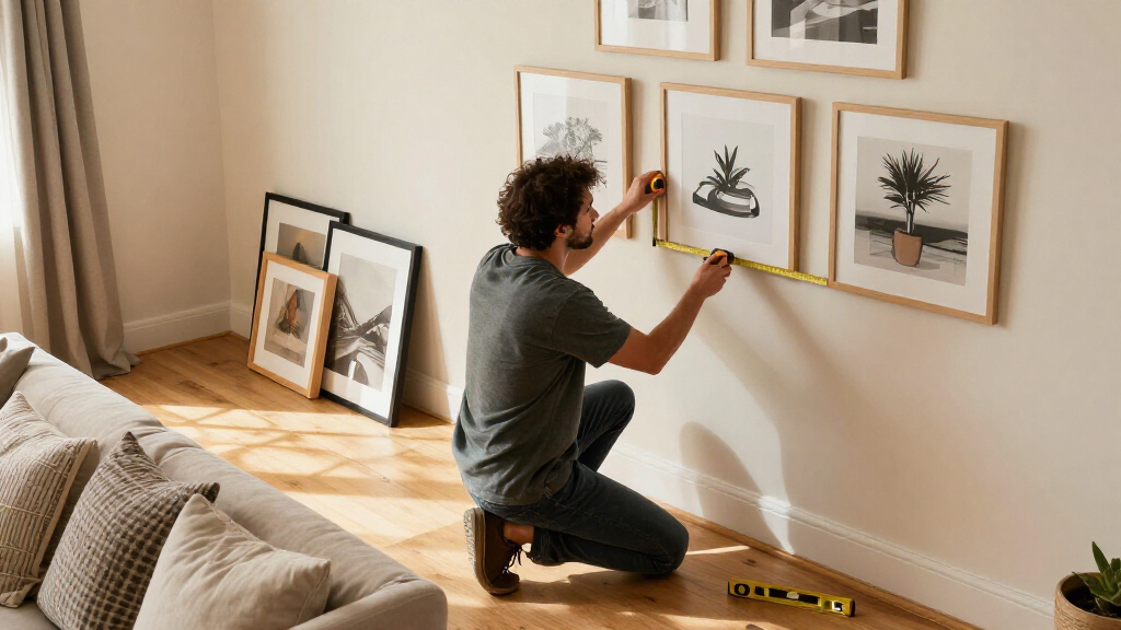
Toronto framing expert Tara Gavin says gallery walls work best when their frames, mats and images follow a clear design direction. In a House Beautiful report, she recommends experimenting with mat colors and negative space, and says black-and-white prints can help family photos taken in different conditions look more cohesive.
Framing expert Tara Gavin, founder of Toronto’s On the Wall Framing, has outlined a design-led approach to gallery walls, recommending considered choices around frame finishes, mat colors and image placement. In a House Beautiful report, she described how those decisions can make a display feel cohesive without relying on matching frames or a standard layout.
One example in the report was a gallery wall Gavin curated with design studio Kessler Levitan for a Toronto family of five. The wall was just 31 inches wide. Rather than use only familiar white mats and wood frames, Gavin combined oak and black frames with burgundy-toned mats and frames. She said the oak kept the arrangement from feeling too formal, while black added contrast and helped connect the composition.
Gavin also recommends treating the mat—the border between an image and its frame—as part of the gallery wall design. A larger mat can give a small photograph more presence. Her team sometimes uses several openings in one frame or places images slightly off-center, instead of automatically centering a single photo. Gavin said these small choices can make the wall feel less predictable.
For family photographs taken at different times and in different lighting, Gavin suggests considering black-and-white printing. She said it can bring visual consistency to a collection, while color can remain part of the display through frames and mats. The report presents this as an option, not a requirement: her broader advice is to choose a direction that suits the room and the images.
Making Personal Photos Feel Collected
Gavin’s advice offers a practical way to turn photographs and prints into a display that feels planned, even when the images vary in size, age or style. A consistent design direction can come from repeated colors, complementary frame finishes or a deliberate approach to spacing; it does not have to mean making every piece identical.
The approach also puts personal photographs on equal footing with purchased art. Gavin told House Beautiful that images kept on phones or in boxes can become meaningful art at home. For readers working with family pictures, her suggestions offer ways to make a display feel connected while retaining the memories that make the images personal.
Products Worth Considering

Makita TM3010CX1 Oscillating Multi-Tool Kit

WORX WX501L 20V Brushless Cordless Reciprocating Saw

EGO Power+ 21” Self-Propelled Electric Lawn Mower with Touch Drive, 56V Battery & Rapid Charger
As an affiliate, we earn on qualifying purchases.
A Narrow Wall Shapes the Design
The Toronto project provides the concrete example behind Gavin’s recommendations. With only 31 inches of width, the team had limited room, and the wall needed to function as a composed feature rather than a loose collection of frames. The resulting mix of burgundy, oak and black shows how a palette can connect different pieces without using one frame style throughout.
The report also distinguishes between the color of the presentation and the color of the photographs. Gavin used color in the mats and frames while printing the images in black and white for the featured project. She said the technique can help family photos taken under different conditions sit together more uniformly, but the article does not suggest every gallery wall needs monochrome images or burgundy accents.
“My team and I love playing with scale, unexpected mat colors, different frame finishes, and the way photographs are positioned within a frame in order to keep them fresh.”
— Tara Gavin, founder of On the Wall Framing, as quoted by House Beautiful
Advice, Not a Universal Formula
The House Beautiful report describes Gavin’s preferences and one commissioned project; it does not establish that a particular palette or arrangement works best for every room. The source gives no detailed measurements for spacing between frames, hanging height, or a step-by-step installation plan. It also does not say how the family or design studio evaluated the finished wall.
Gavin’s suggestions are framed as options. Black-and-white printing, colored mats and off-center placement are techniques to consider, not fixed rules. The report does not compare them with other approaches or provide evidence that one method produces better results for all photographs or interiors.
Apply the Ideas to Your Wall
The report does not announce a follow-up project or a scheduled next development. Readers can use Gavin’s approach by first choosing a design direction, then testing how frame finishes, mat colors and photo treatments work together before hanging the pieces. For family images with noticeably different color and lighting, black-and-white printing is one option to try; for smaller pictures, wider mats or multiple openings can change how they read.
The next decisions depend on each collection and room: which colors connect with nearby furnishings, how much negative space suits the images, and whether a varied layout feels intentional. Gavin’s central point is to make those choices deliberately rather than defaulting to identical white mats and wood frames.
Key Questions
What does Tara Gavin say is the key to a gallery wall?
Gavin says it should have a clear design direction, created through considered choices in scale, mat color, frame finish and image placement.
Does every frame in a gallery wall need to match?
No. In the Toronto project described by House Beautiful, Gavin combined oak and black frames with burgundy-toned mats and frames. The report presents variety as one way to build a connected composition.
Why use black-and-white family photos?
Gavin says black-and-white printing can help photographs taken in different lighting and at different times feel more visually consistent. She presents it as an option, not a requirement.
How can mats change a gallery wall?
A mat creates negative space around an image and can give a small photograph more presence. Gavin also suggests using multiple openings in one frame or placing images off-center to vary the composition.
Source: housebeautiful.com