
TL;DR
Listen free for 30 days with Audible
Thousands of audiobooks and originals — cancel anytime.
Start your free trialAs an affiliate, we earn on qualifying purchases.
A well-designed gallery wall with a clock depends on proportion, placement, and balance. Using templates and following key principles helps create a cohesive, eye-catching display that reflects your style.
Imagine walking into a room where the wall immediately catches your eye — a stunning gallery of photos, artwork, and a bold clock anchoring it all. A well-planned gallery wall isn’t just about hanging pictures; it’s about creating a visual story that feels natural and inviting. Incorporating a clock adds personality, function, and a focal point that pulls the whole display together.
You’ll learn how to choose the right size, layout templates that suit different spaces, and tips for balancing art and timepieces. Whether you prefer a symmetrical grid or a more relaxed, asymmetrical vibe, this guide will help you craft a gallery wall that’s both stylish and meaningful.
Choose a clock size that’s roughly one-third to one-half the width of your entire gallery wall for balance.
Use templates—physical or digital—to plan your layout before hanging, saving time and effort.
Mix and match frame styles and colors, but keep a cohesive theme or palette for visual harmony.
Start with the clock placement to anchor your design, then build around it for symmetry or a relaxed, eclectic look.
Measure spacing carefully—2 to 5 inches between pieces creates a clean, organized appearance.
How to Pick the Perfect Size and Placement for Your Clock
Choosing the right size and placement for your clock is the foundation of a balanced gallery wall. A good rule of thumb: the clock’s diameter should be about one-third to one-half the width of your entire arrangement. This proportion ensures the clock is a noticeable focal point without overwhelming the other pieces. Placing it at eye level, approximately 57-60 inches from the floor, helps create a natural viewing experience—your eye naturally gravitates toward objects at this height, making the display feel harmonious and accessible.
Think about the space’s function and the wall’s dimensions. In a cozy living room, a 24-inch clock hung above the sofa creates a central anchor that ties the seating area together. On larger walls, a 30- to 36-inch clock serves as a bold statement piece, around which artwork can be arranged to balance visual weight. The key is to consider how the size interacts with the surrounding space—too small, and it gets lost; too large, and it can dominate or disrupt the flow of the display. The goal is to find a size that commands attention but still feels integrated into the overall composition.

Howard Miller Gallery Wall Clock – Round Black Frame, Optical Crystal Glass, Arabic Numerals, Battery-Operated Quartz Movement
- Sleek, versatile design: Matte black frame with white dial
- Optical crystal glass lens: Protects dial with glare resistance
- Easy-to-read dial: Bold Arabic numerals and clear hands
As an affiliate, we earn on qualifying purchases.
As an affiliate, we earn on qualifying purchases.
3 Popular Layout Templates That Make Your Wall Look Effortless
Here are three tried-and-true templates that suit different styles and wall sizes, each offering a different way to create visual harmony and interest:
- Centered Grid: This template emphasizes balance and symmetry. By placing the clock at the center and surrounding it with evenly spaced frames in a grid pattern, you create a structured, orderly look reminiscent of museum displays. This approach works well in smaller spaces or when you want a clean, formal aesthetic. The uniformity guides the eye naturally toward the center, making the clock the star while the surrounding artwork supports it without competing.
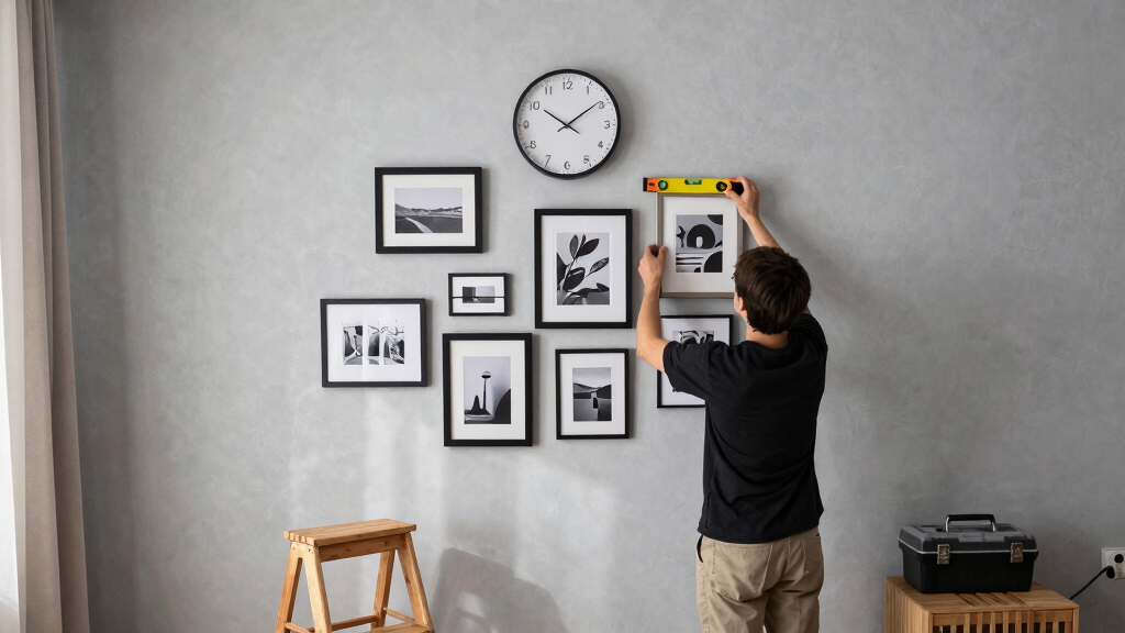
- Asymmetrical Cluster: For a more relaxed, eclectic vibe, position the clock slightly off-center and arrange your artwork in a loose, organic cluster around it. This method emphasizes visual interest and personal expression, allowing for varied frame sizes, shapes, and orientations. The tradeoff is that it requires a good eye for balance—too chaotic, and the display can feel cluttered; too orderly, and it loses its spontaneous charm. The key is to create a sense of flow and harmony despite the irregular arrangement, which makes the display feel curated rather than haphazard.
- Linear or Horizontal: Ideal for above a sofa or console, this layout aligns the clock at one end or in the middle of a horizontal line of frames. It emphasizes movement and flow across the wall, making the space feel dynamic and modern. The challenge here is to maintain consistent spacing and scale across the arrangement, so it doesn’t appear disjointed. This layout works best when the artwork relates in theme or color, creating a cohesive narrative along the horizontal plane.
Each template offers a different way to achieve visual harmony, but the choice depends on your space, style, and how much emphasis you want to place on the clock versus the artwork. Experimenting with these templates helps you find the one that best reflects your personality while maintaining a balanced composition.

ArtbyHannah Gallery Wall Frame Set, 8 Pack Beige Picture Frames, Large
- Neutral Landscape Artwork: Pampas grass and desert scenery
- Sturdy Lightweight Frames: Durable beige MDF construction
- Multiple Sizes Included: Variety of frame dimensions
As an affiliate, we earn on qualifying purchases.
As an affiliate, we earn on qualifying purchases.
Designing a Cohesive Look with Style and Color Choices
The magic of a gallery wall with a clock lies in how well all elements work together. Keep frames consistent—match in color, material, or style—or intentionally mix for a more layered effect. For example, pairing vintage wood frames with sleek black metal ones can create a charming contrast. The decision influences the overall mood: uniform frames tend to produce a polished, cohesive look, while mixed styles add personality and visual interest—but require careful balancing to avoid a cluttered appearance.
Colors matter too. A monochrome palette—black, white, and gray—keeps things simple and modern, allowing the clock to stand out as a statement piece. Conversely, choosing a bold color for your clock that contrasts with neutral backgrounds creates a focal point that draws the eye immediately. For instance, a deep navy clock surrounded by warm-toned photographs not only adds visual punch but also ties the entire display together through color harmony. Understanding how color influences perception helps you craft a display that feels intentional and balanced, rather than chaotic or disconnected.
Texture adds depth and richness. Mixing smooth glass with textured mats or metallic frames introduces tactile variety, guiding the viewer’s eye across the display. This interplay of textures prevents the arrangement from feeling flat and adds a layer of sophistication. The key is moderation: too many contrasting textures can feel disjointed, while a well-balanced mix enhances the overall aesthetic and invites closer inspection.

LEIKE Metal Large Wall Clock 24IN Black, Retro Silent Quartz Battery Operated, Decorative for Patio, Kitchen, Living Room, Bedroom, Pool
- Retro Vintage Design: Metal frame with HD glass cover
- Versatile Decor: Suitable for various rooms and settings
- Durable Construction: Rustproof iron frame for longevity
As an affiliate, we earn on qualifying purchases.
As an affiliate, we earn on qualifying purchases.
Using Templates and Tools to Plan Your Perfect Wall
Planning ahead is crucial because it helps you visualize how different elements will interact before making permanent holes. Use printable templates or online room planners to simulate your layout. Cutting out paper versions of your frames and the clock allows you to experiment with spacing, arrangement, and scale in real space—seeing how each element relates to the others helps identify potential issues early, saving time and frustration.
For larger or more complex walls, a grid template can be especially helpful. Measure the entire wall and divide it into equal sections, then mark where each piece will go. This approach ensures consistent spacing and alignment, which is vital for a polished look. It also helps prevent common pitfalls like crowded corners or uneven gaps that can distract from the overall harmony.
Patience in planning pays off. Taking the time to map out your design reduces the need for re-hanging and makes the process more enjoyable. The result is a thoughtfully curated display that feels intentional, balanced, and visually appealing from every angle.

Big John Products The Ultimate Picture and Wall-Hanging Template
- Weight: 1 lb
- Package Quantity: Single unit
- Quality: Excellent quality
As an affiliate, we earn on qualifying purchases.
As an affiliate, we earn on qualifying purchases.
Common Mistakes to Avoid When Creating Your Gallery Wall
One mistake is hanging everything at once without planning. This can lead to a cluttered, unbalanced look that feels chaotic rather than curated. Instead, step back periodically during the process to evaluate your layout. Use tape or paper templates to visualize spacing and placement beforehand. Adjust as needed to ensure each piece complements the others and contributes to a cohesive whole. This mindful approach helps you catch potential issues early and creates a more polished final display.
Another pitfall is ignoring scale. A tiny clock on a large wall can look insignificant, making the whole arrangement feel disjointed. Conversely, an oversized clock can dominate and overshadow other elements, disrupting visual harmony. Striking the right scale involves considering both the wall size and the surrounding artwork, ensuring each piece is proportionate and contributes to a balanced composition. Remember, scale influences how viewers perceive the relationship between elements—proper proportions create a sense of unity and flow.
Spacing is also critical. Too little space between pieces can make the display appear crowded and overwhelming, while too much space can make it seem disjointed. Aim for 2-5 inches between frames and around the clock, which provides enough breathing room for each element to stand out without losing the sense of being part of a cohesive story. Proper spacing enhances visual clarity and makes the entire arrangement more inviting and organized.
Frequently Asked Questions
How do I decide what size clock fits my wall best?
Start by measuring your wall’s width. Aim for a clock that’s about one-third to one-half of that width. For example, on a 120-inch wall, a 40- to 60-inch clock works well without overpowering the space.Can I mix different art styles and frame colors?
Absolutely! Eclectic arrangements are popular, but keep a common thread—like a shared color palette or similar framing material—to maintain cohesion and avoid chaos.What’s the easiest way to visualize my layout before hanging?
Use paper cutouts or print templates of your frames and clock. Lay them out on the floor or tape them to the wall to experiment with spacing and arrangement before making holes in the wall.How far apart should the frames be from each other and the clock?
Aim for 2 to 5 inches of space between each piece. This allows each element to stand out while maintaining a unified, uncluttered look.Are there specific tools that make planning easier?
Yes, printable templates, online room planners, or even simple painter’s tape can help you map out your design accurately and efficiently.Conclusion
A gallery wall with a clock isn’t just decoration—it’s a reflection of your style and personality. With a little planning, you can craft a display that’s both eye-catching and meaningful.
Think of your wall as a canvas, where every piece tells a story. When the clock and artwork work together, they turn a blank space into a living piece of art that invites conversation and admiration.
Pool season Picks
robotic pool cleaners
As an affiliate, we earn on qualifying purchases.