
TL;DR

Get decor and gifts delivered free with Prime
- Fast, free delivery on millions of items
- Prime Video, Amazon Music and more included
- Member-only deals all year
Livingetc reports that ochre is gaining attention in interior design as a deeper, earthier alternative to bright yellow. Color expert Amy Moorea Wong and designers describe ways to use it, including painting walls, pairing it with brighter yellow and combining it with timber and other natural materials.
Livingetc has reported growing interest in ochre, a warm, earthy shade of yellow, and outlined ways designers are using it in interiors. The report presents the color as an alternative to brighter yellows, with examples ranging from ochre-painted kitchen walls to deep ochre tiles paired with patterned yellow wallpaper.
Livingetc color expert Amy Moorea Wong describes ochre as a yellow with added depth, generally tinted with brown, orange or red. Compared with sunshine yellow, it is deeper, warmer and less saturated. Wong likens its color to honey and says it can retain a luminous quality while feeling connected to natural earth tones.
The report connects the shade’s current appeal to a wider interior design preference for warm, personal and collected spaces. Wong says ochre fits alongside earthy colors such as terracotta, reds and caramel. She also describes it as a more subdued form of yellow, with a nostalgic association with 1970s interiors. These are expert observations about design preferences, not measured market data.
One example in the report is a kitchen painted in Farrow & Ball’s India Yellow, a deep yellow, selected to balance the room’s steel and timber structure. Designer Sophie Goldhill of Liddicoat & Goldhill and Hector Interiors says the shade worked with the building’s industrial features and natural materials. Another example from designer Rachel Robinson of Dunham Robinson pairs deep ochre wall tiles with brighter yellow patterned wallpaper in a powder room.
Ochre’s Role in Warmer Interiors
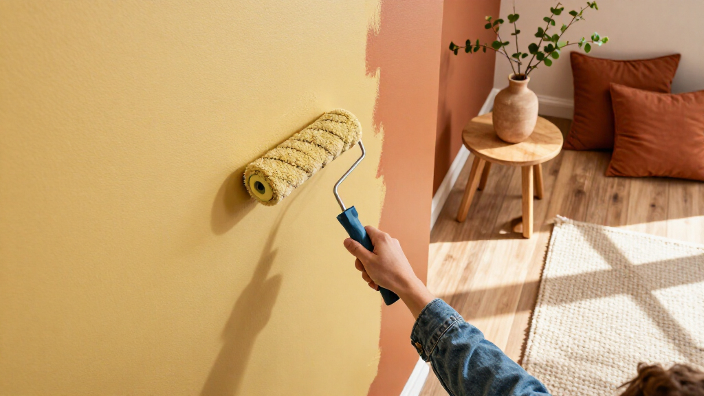
For readers choosing paint or finishes, the report offers a practical distinction: ochre is not simply bright yellow. Its earthier undertones may make it easier to combine with timber, architectural details and other natural materials, while still adding warmth and color. The examples show two different levels of commitment: using the shade across walls or introducing it through tiles and pairing it with a lighter yellow.
The guidance is useful as design inspiration, rather than proof that ochre is objectively more popular or suitable for every room. The report does not provide sales figures, survey results or a measured trend comparison. Its case for the color rests on expert commentary and selected interior projects.
As an affiliate, we earn on qualifying purchases.
A Historic Pigment, Newly Styled
Ochre has a history that predates modern paint palettes. Wong says it is among the oldest natural pigments and points to examples of its use in prehistoric Kenya and Zambia, Aboriginal Australian ceremonies, ancient Egyptian tomb paintings and Roman frescoes. The report invokes that history to explain the color’s association with natural materials and longstanding decorative traditions.
In the current interiors discussion, the shade is presented as part of a turn toward earthy colors and warmer rooms. Wong contrasts it with green, which she says has been widely used, and with buttery yellow, describing ochre as a more grounded progression. The article’s examples focus on paint and tile; it does not claim that a particular product or palette is newly released.
“Ochre lands somewhere between a field of sunflowers in full bloom and a pot of liquid gold, like a deeply enriched yellow that’s fallen into shadow.”
— Amy Moorea Wong, Livingetc color expert
As an affiliate, we earn on qualifying purchases.
How Broad Is the Color’s Appeal?
The report does not quantify how widely ochre is being adopted, identify a publication date in the supplied material, or cite consumer or industry data to establish the scale of the trend. Its description of growing interest is based on the article’s design reporting and the views of its contributors. It also does not establish that the shade will suit every room: lighting, surface, and surrounding colors can affect how a paint or tile reads.
As an affiliate, we earn on qualifying purchases.
Testing Ochre in Your Room
The report offers no scheduled follow-up or product launch. For readers considering the color, the practical next step is to compare samples in the room where they will be used: the article notes that a deep yellow paint can look livelier in bright light and more subdued in lower light. Designers cited by Livingetc suggest deciding whether to use ochre across a larger surface, such as walls, or in a smaller application such as tiles, then judging it alongside timber, steel or brighter yellow accents.
As an affiliate, we earn on qualifying purchases.
Key Questions
What color is ochre?
Ochre is a warm, earthy yellow, often with brown, orange or red undertones. Livingetc’s Amy Moorea Wong describes it as deeper and less bright than sunshine yellow.
How are designers using ochre?
The report features deep yellow paint on kitchen walls and ochre tiles paired with brighter yellow patterned wallpaper. It also describes combining the shade with timber and other natural materials.
Is ochre a current interior design trend?
Livingetc reports growing interest in ochre and says designers see it as fitting the move toward warmer, earthier interiors. The article provides expert commentary and examples, but no figures measuring its popularity.
Does ochre look the same in every room?
No. The report notes that deep yellow paint can look livelier in bright light and more earthy in lower light. Testing a sample in the intended room can help show how it works with that space’s materials and lighting.
Source: rss
Columbus Day / Indigenous Peoples' Day Picks
long weekend sales
As an affiliate, we earn on qualifying purchases.